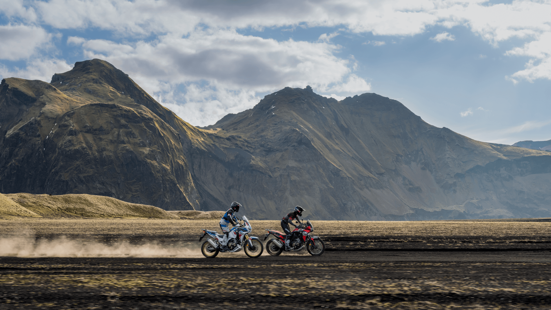

Honda Powersports
The team at 9th Wonder was in need of additional creative firepower to help imagine a new and improved version of the Honda Powersports website. They hired Idol to bring an outside perspective and provide expertise across UX and UI design.
With our rich history working in automotive, this project was right in our wheelhouse. Across a fast and furious two week design sprint, we developed more than three robust design directions to help steer the legacy brand into the modern age.
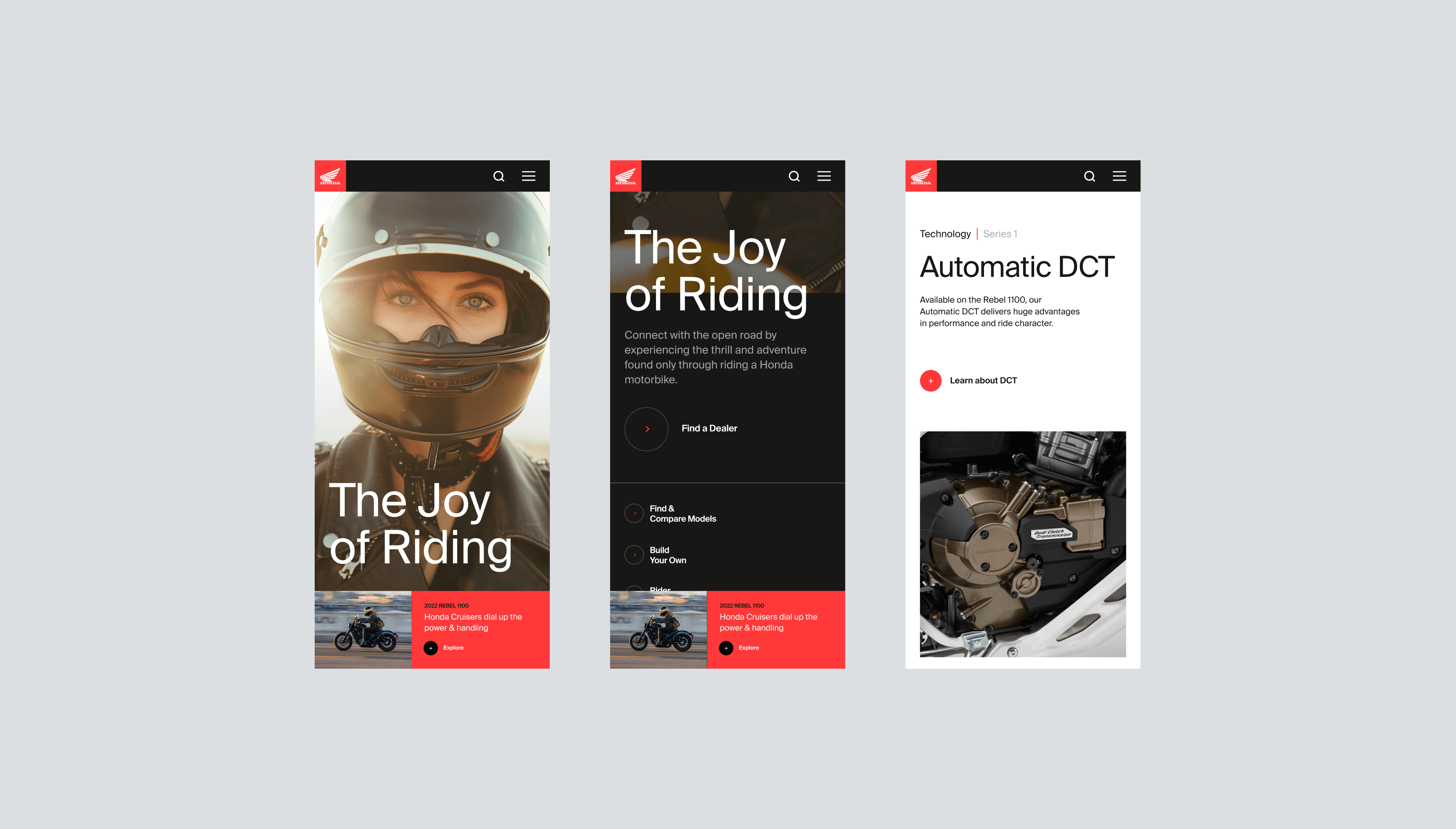
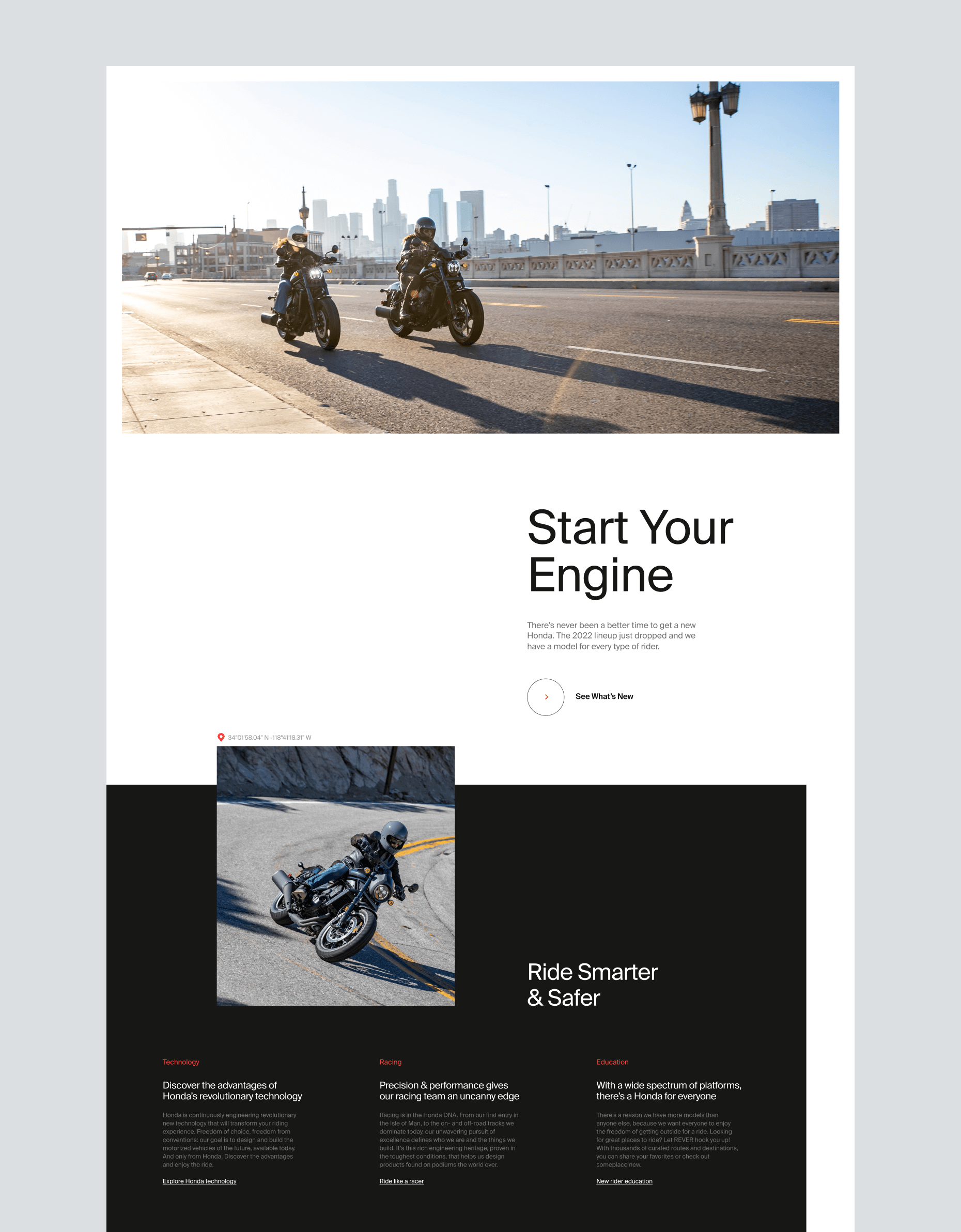
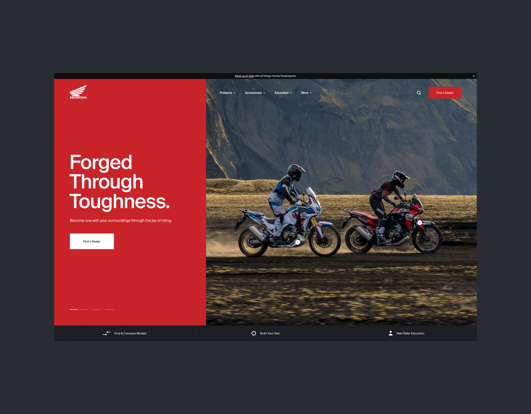
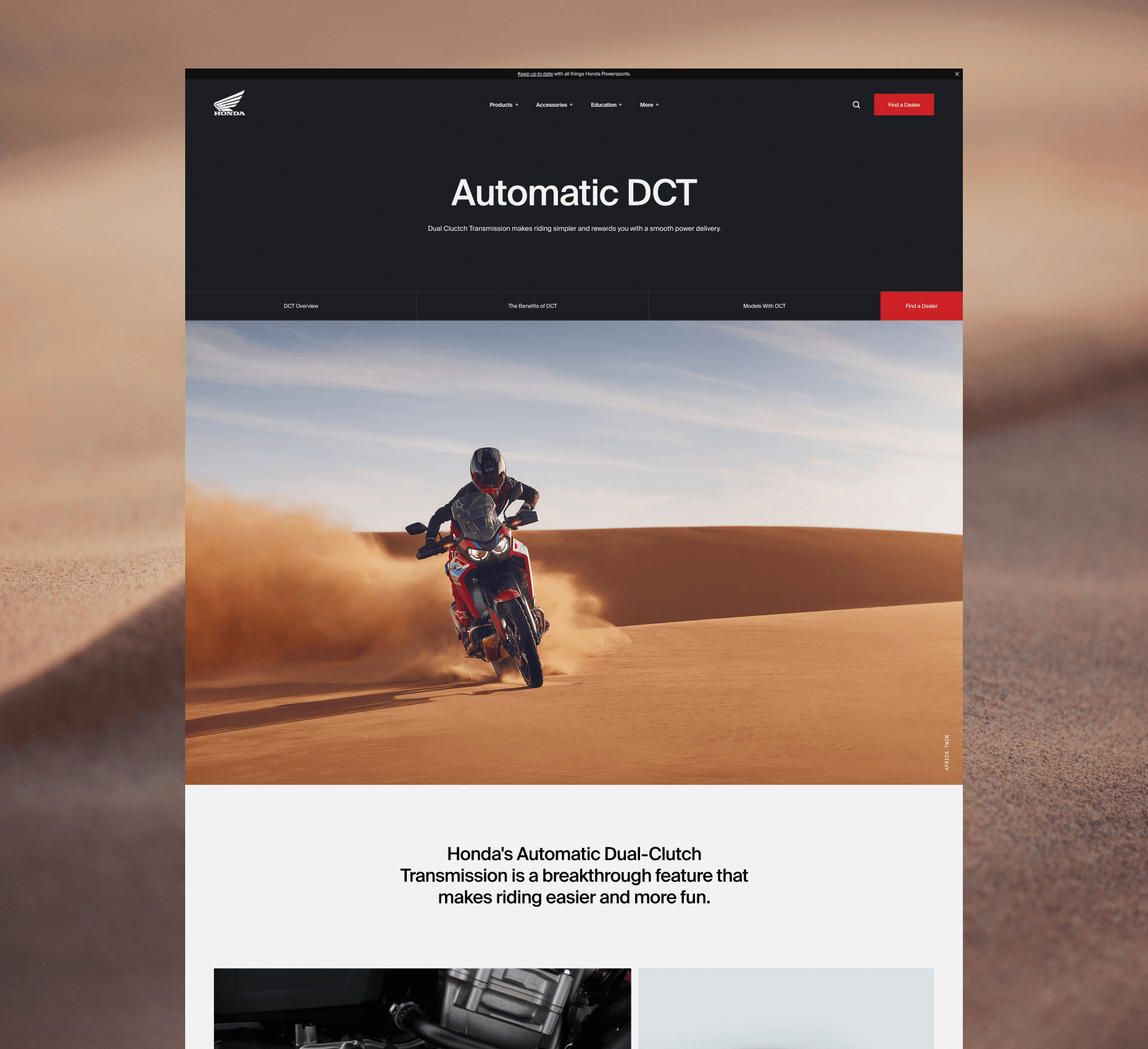
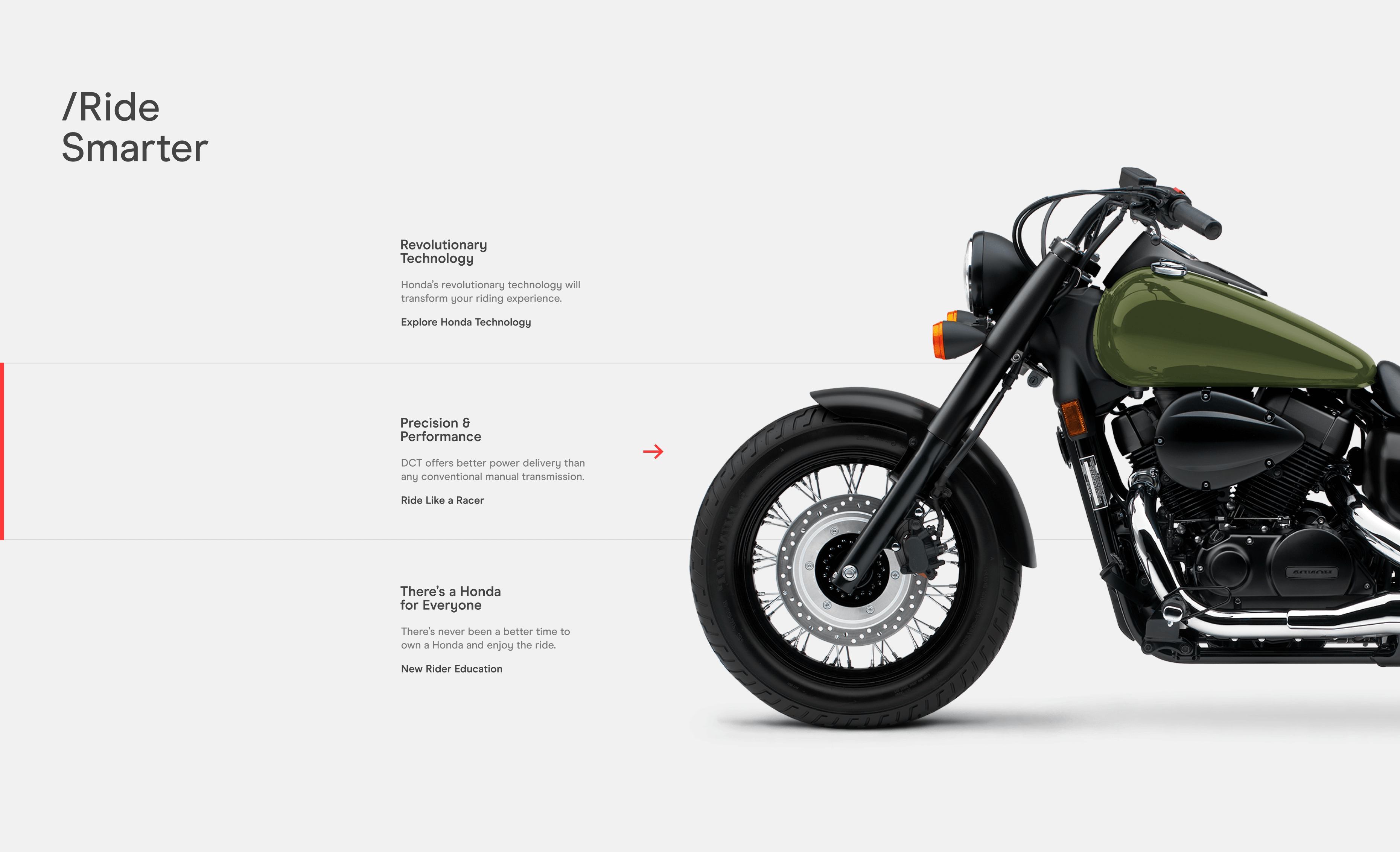
Design Direction 1
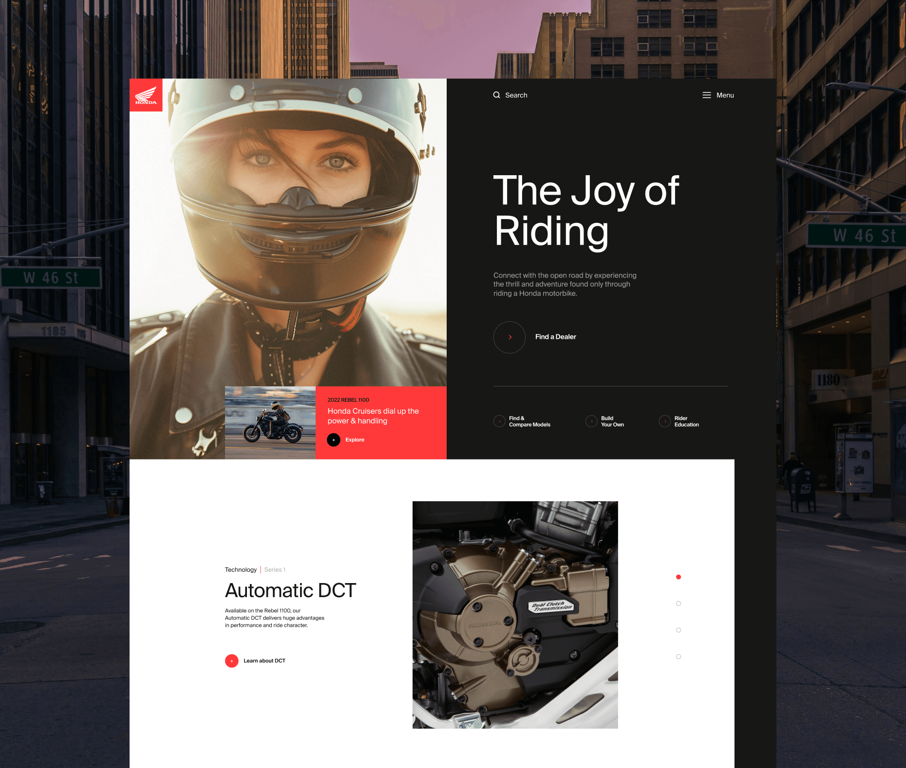
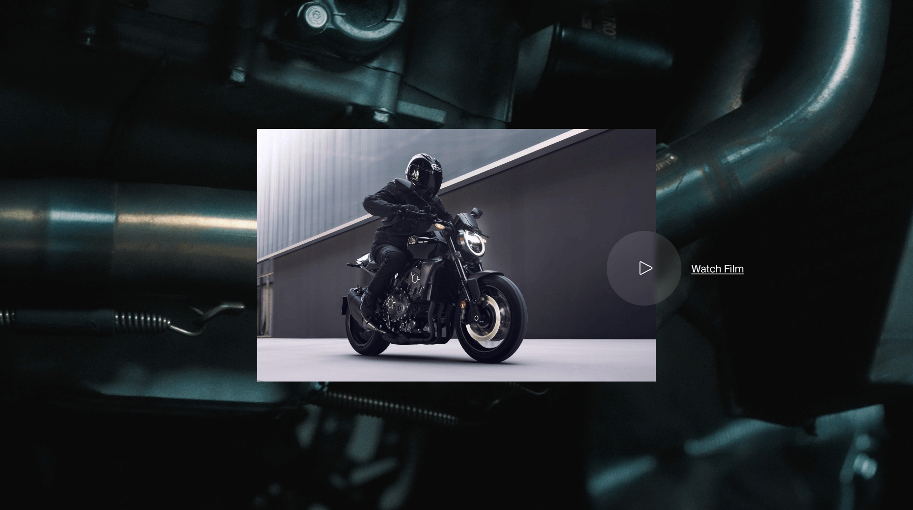
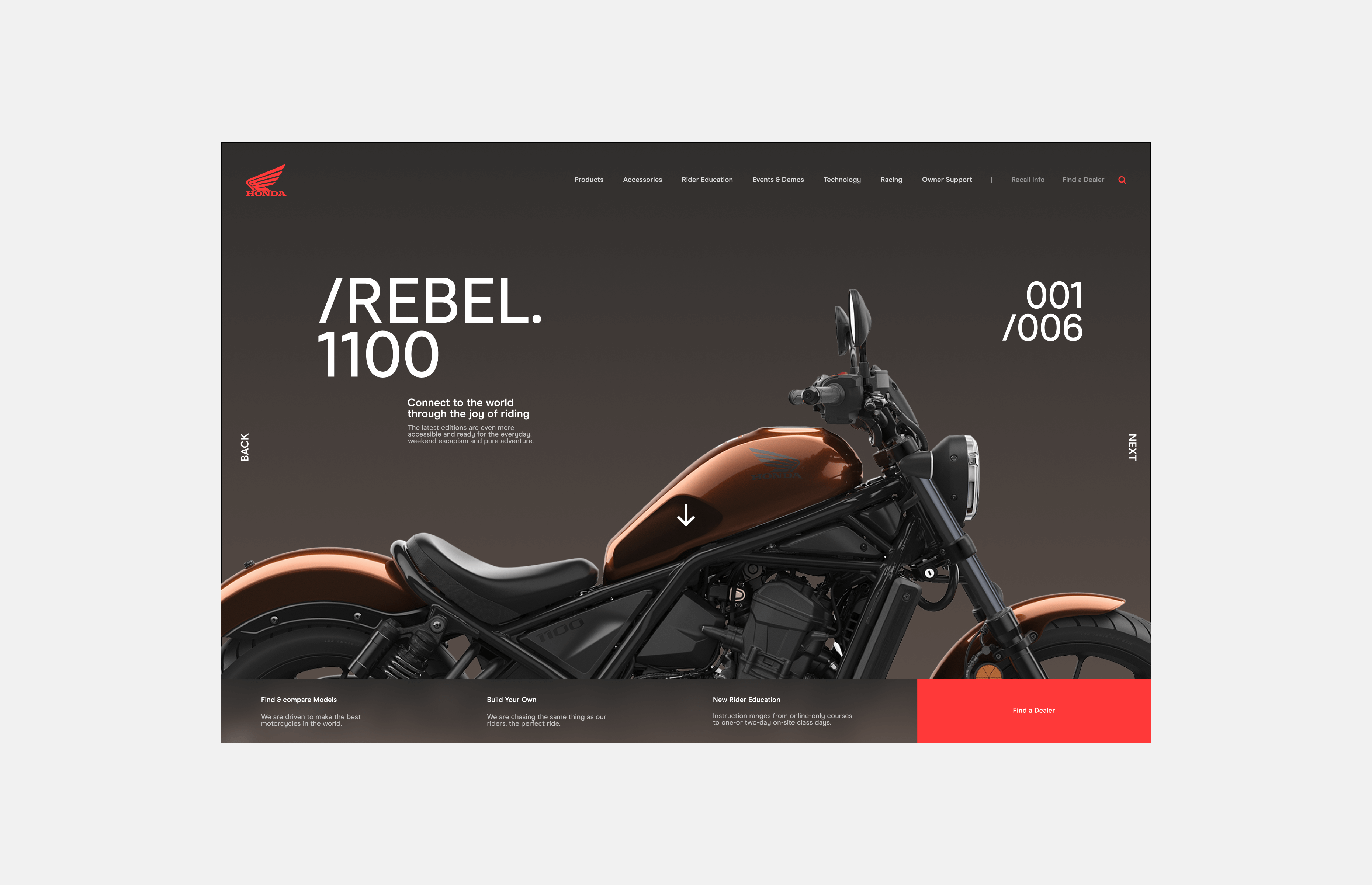
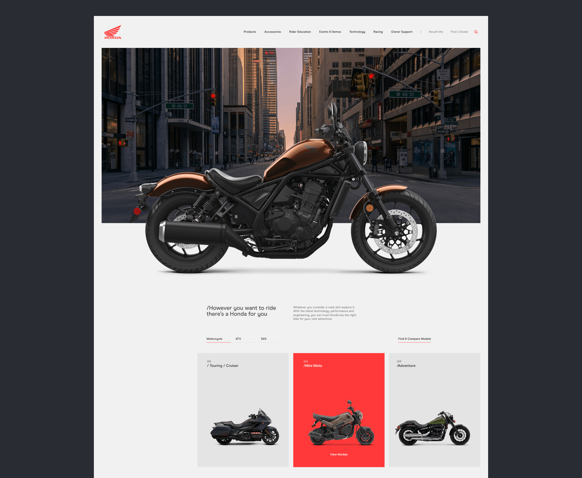
Design direction 1 encapsulates a clean and modern aesthetic, utilizing a flexible grid structure and minimal decoration. Strong typographic hierarchy and plenty of negative space around elements helps to frame content and reduce cognitive fatigue — allowing the user to easily digest information as they scroll each page. Expansive imagery is used as a thematic backdrop behind blocks of content to create strong emotional connections to the joy of riding and adventure.
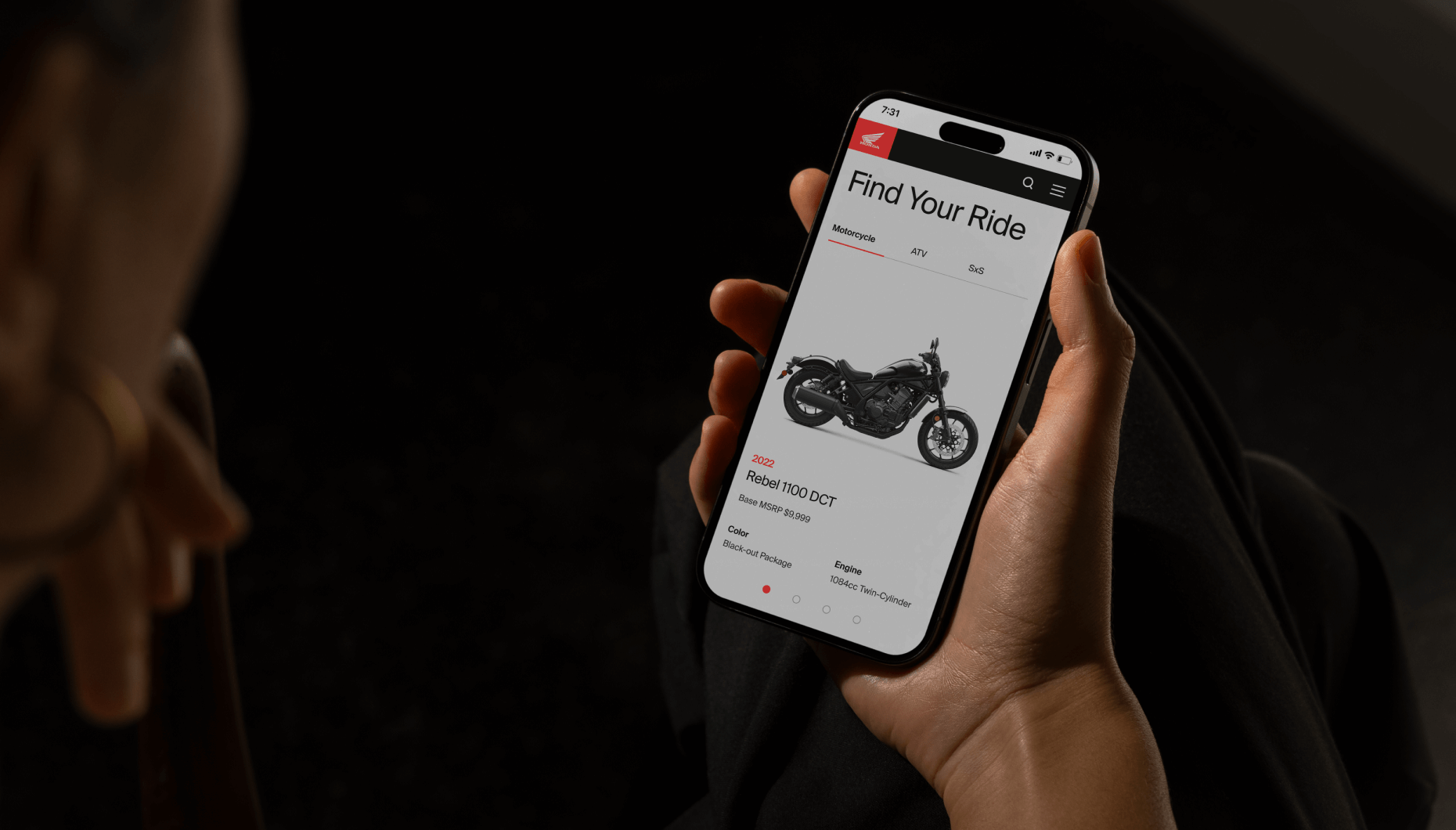
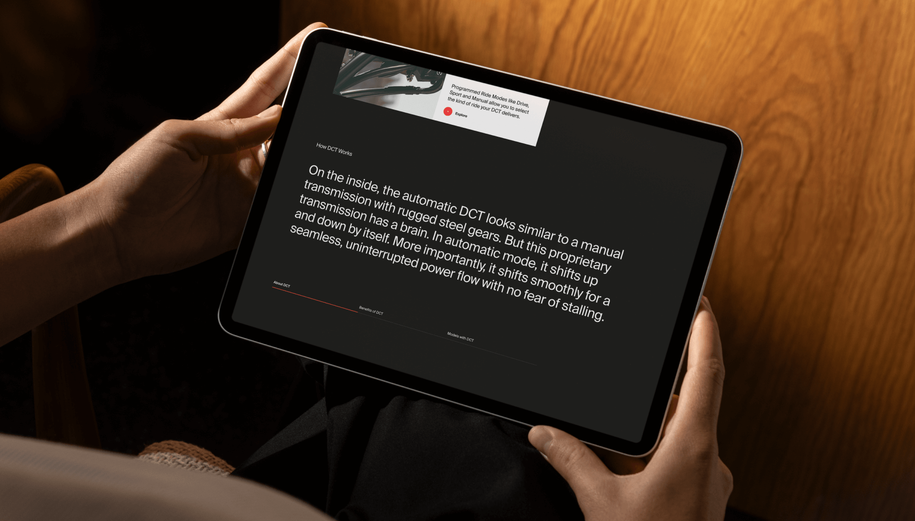
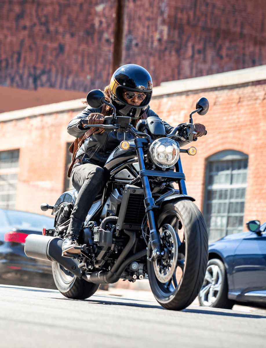
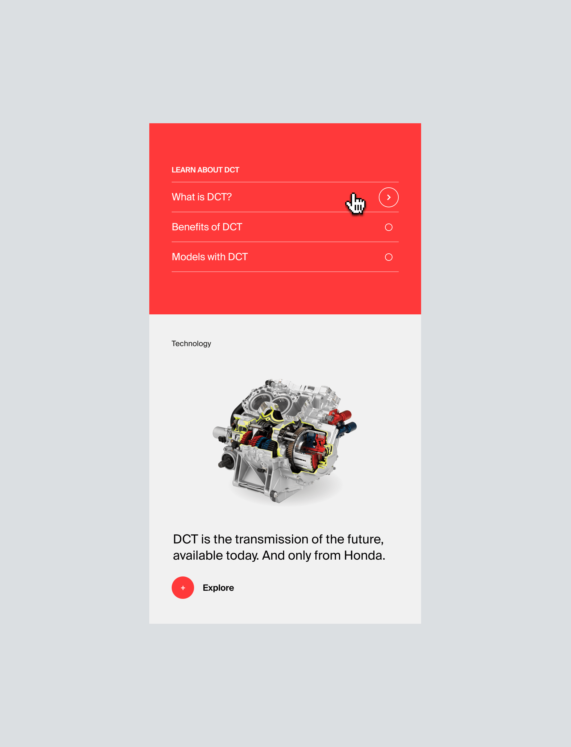
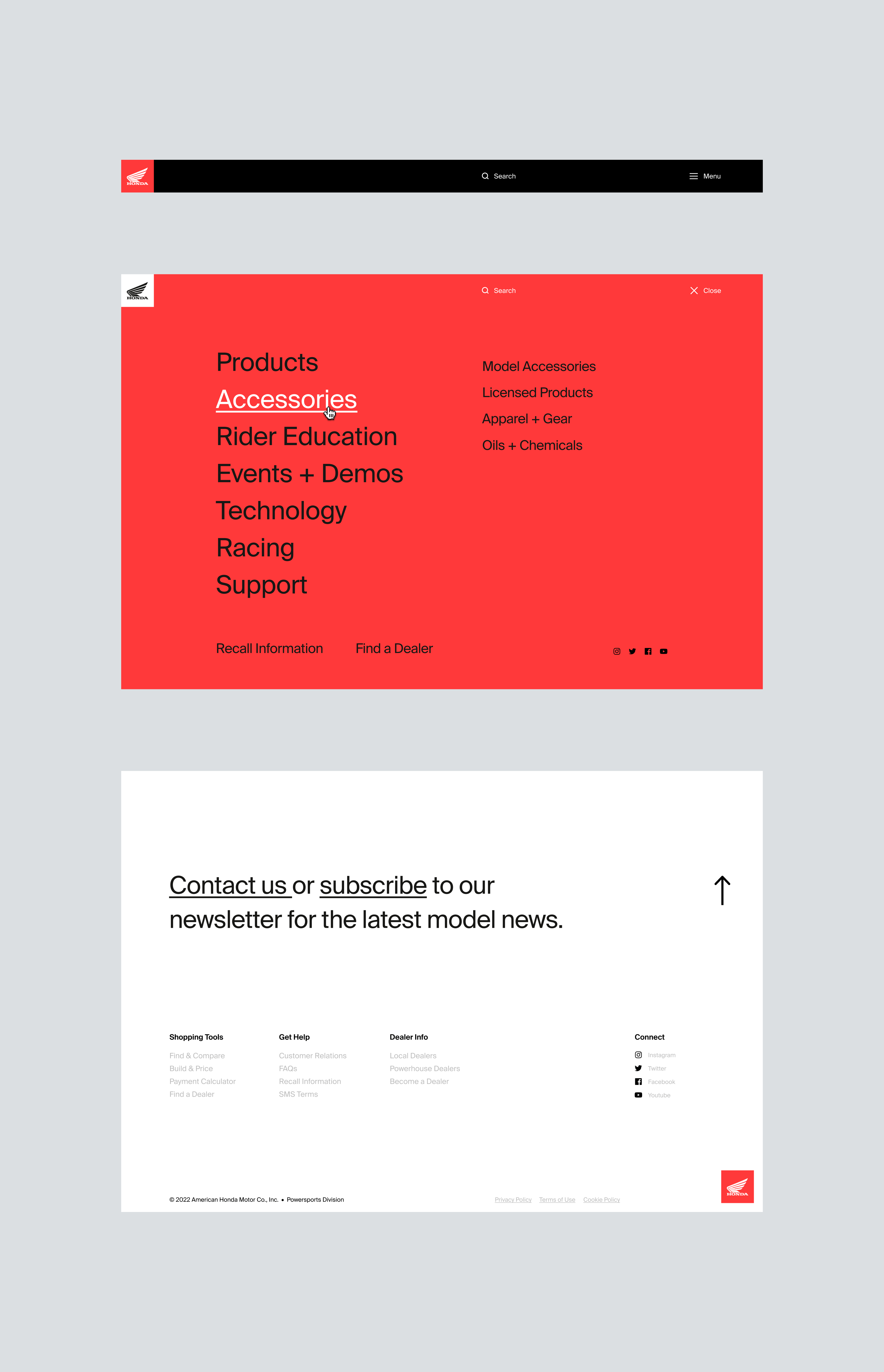
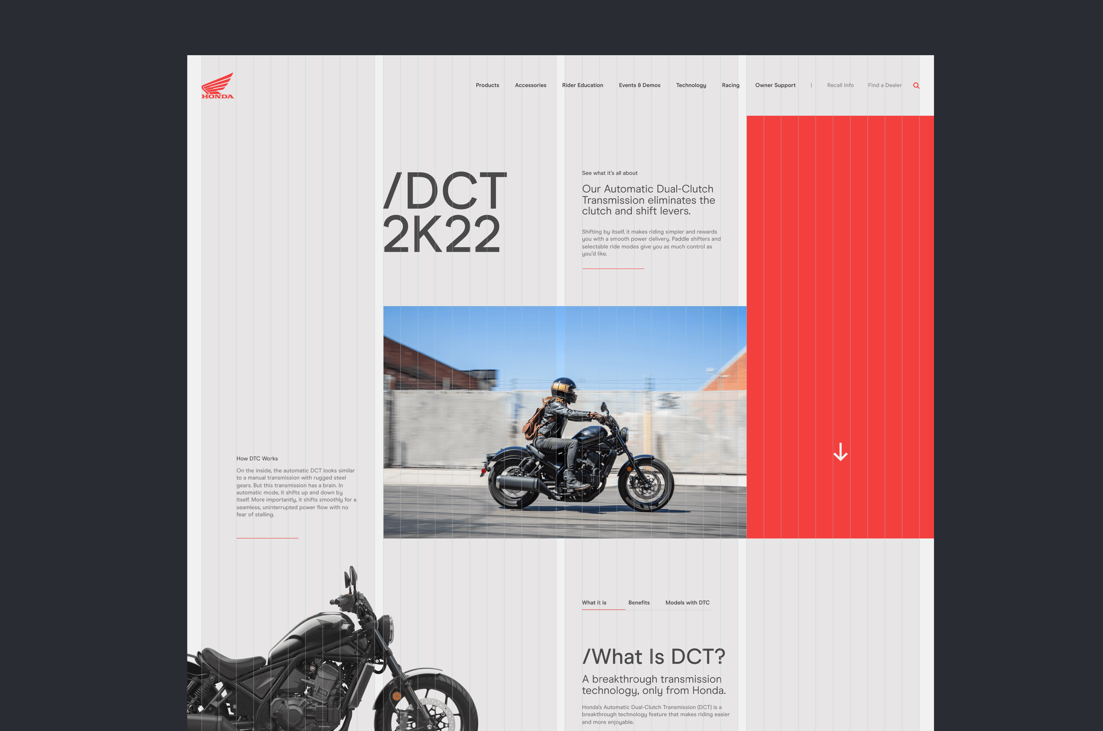
Design Direction 2
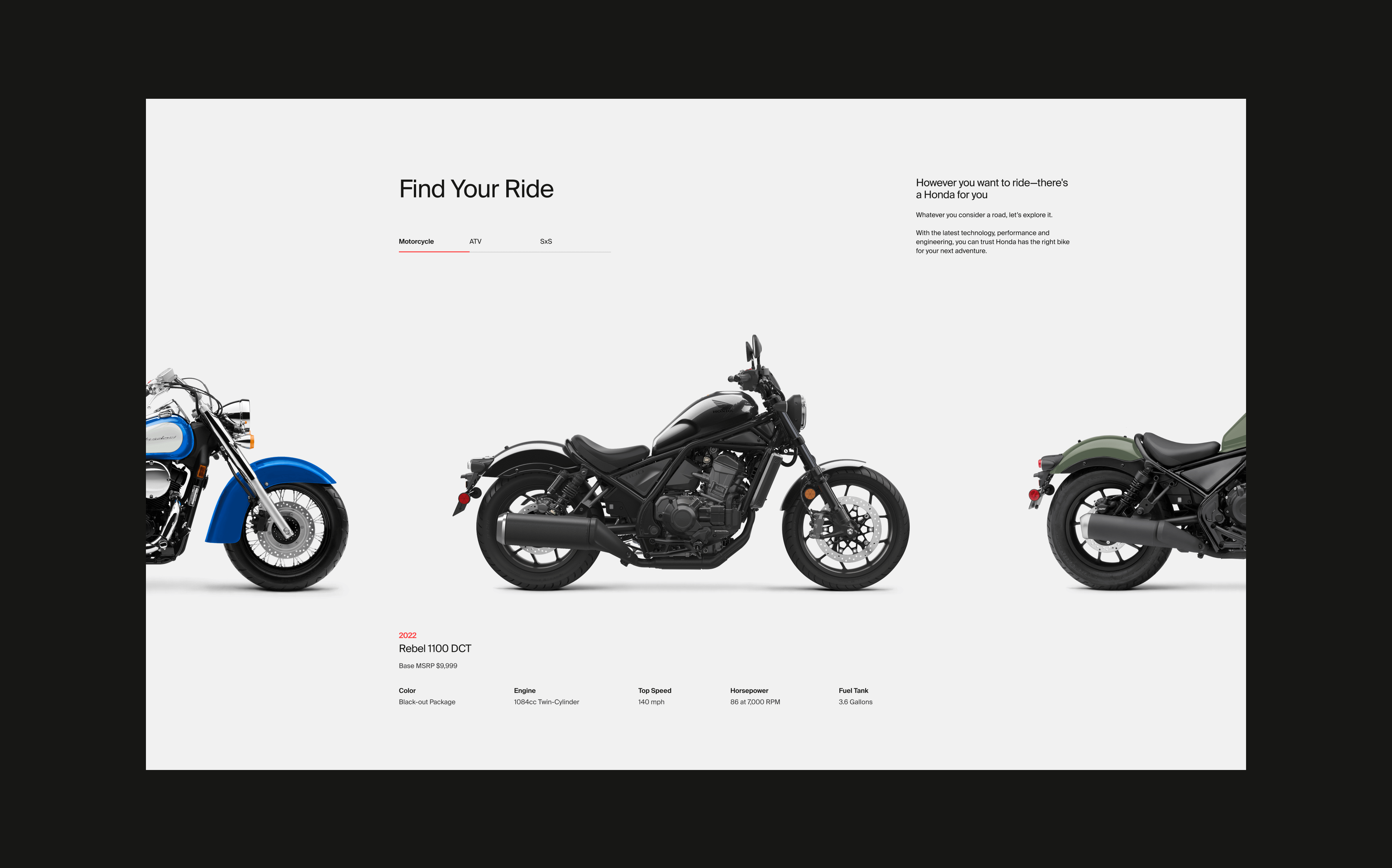
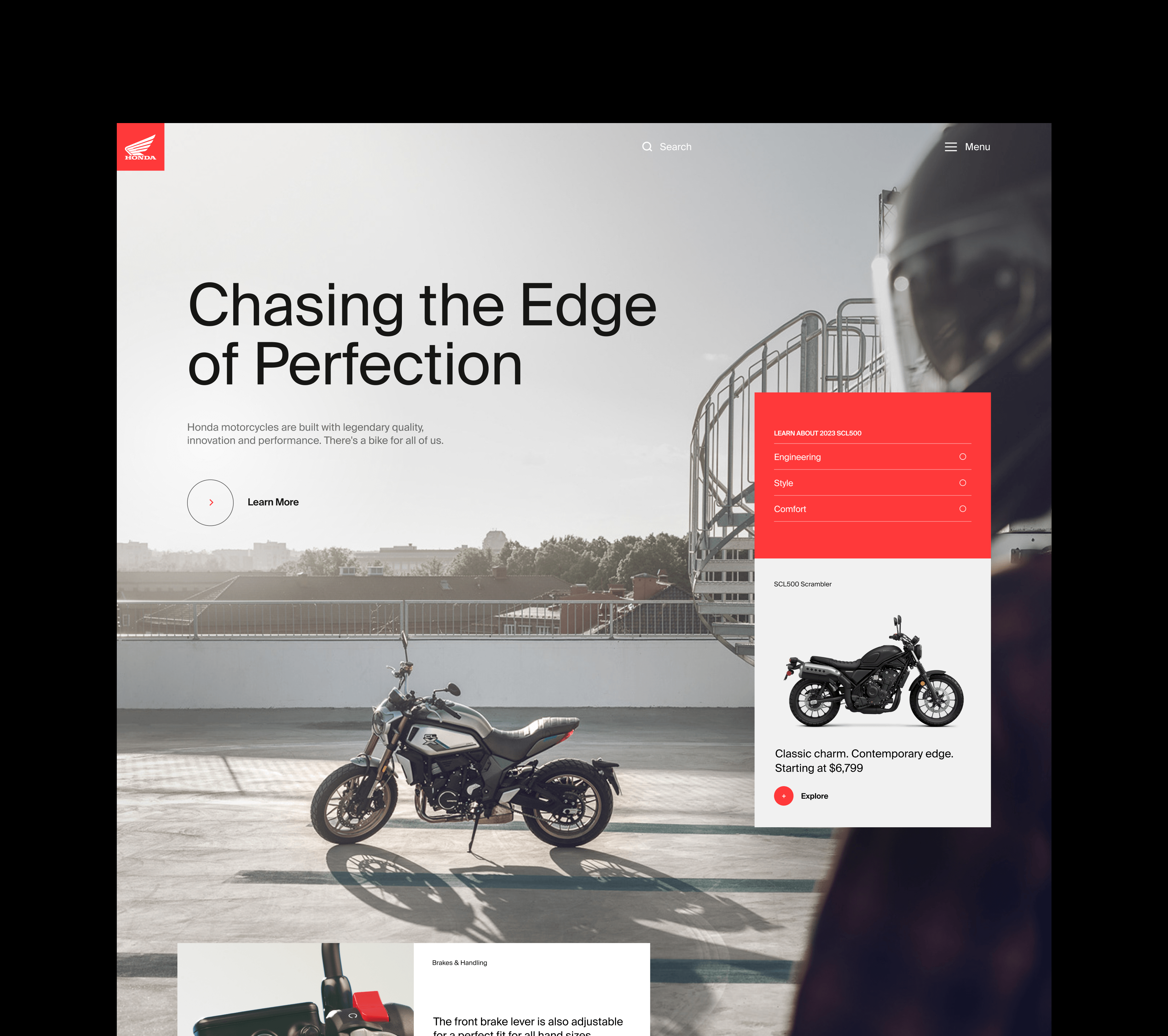
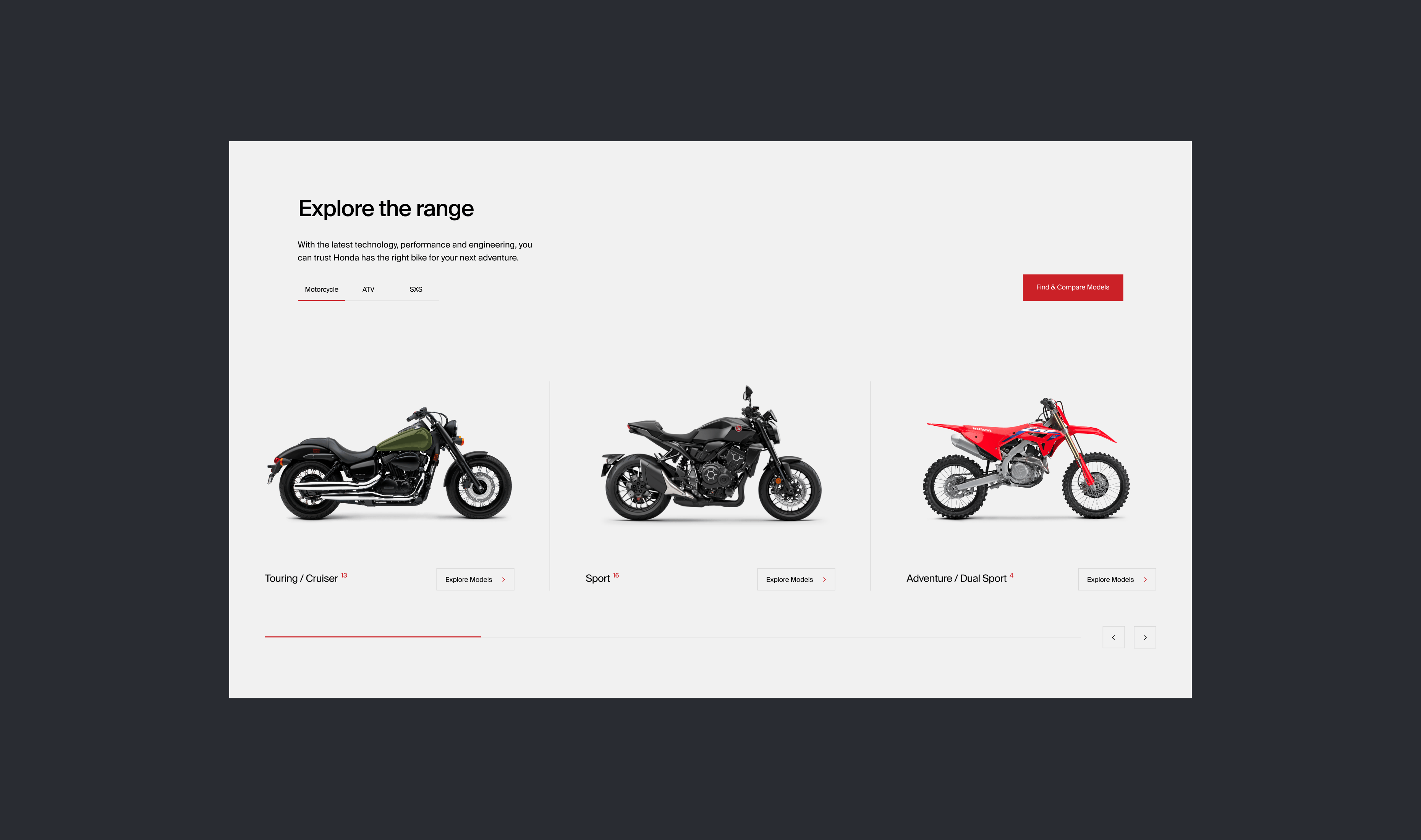
Design direction 2 takes a more classic stance. The traditional Honda red is used as a central accent and the layouts are slightly more formulaic — stacking content rows like simple building blocks. This approach creates an opportunity to reduce the need for page templates and opts for a component based system where the content blocks can be seamlessly arranged for unlimited page expression and scalability.
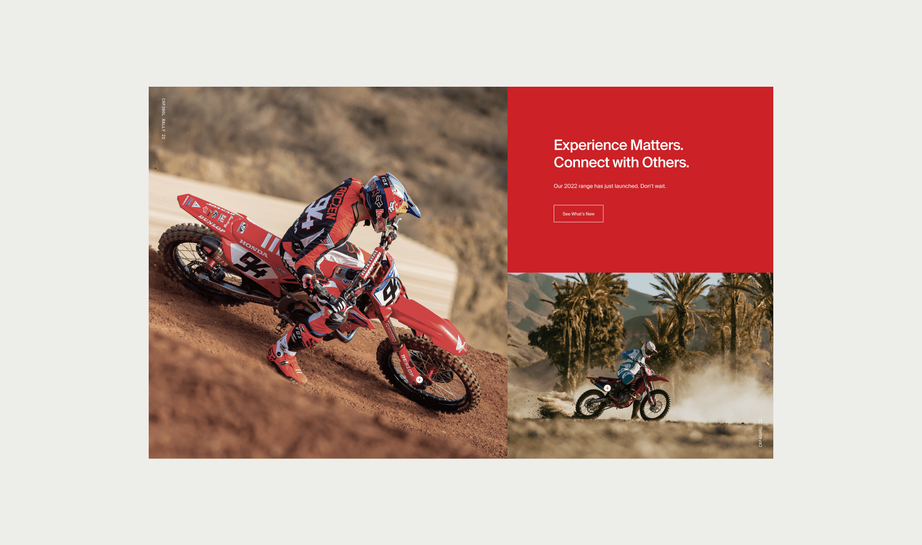
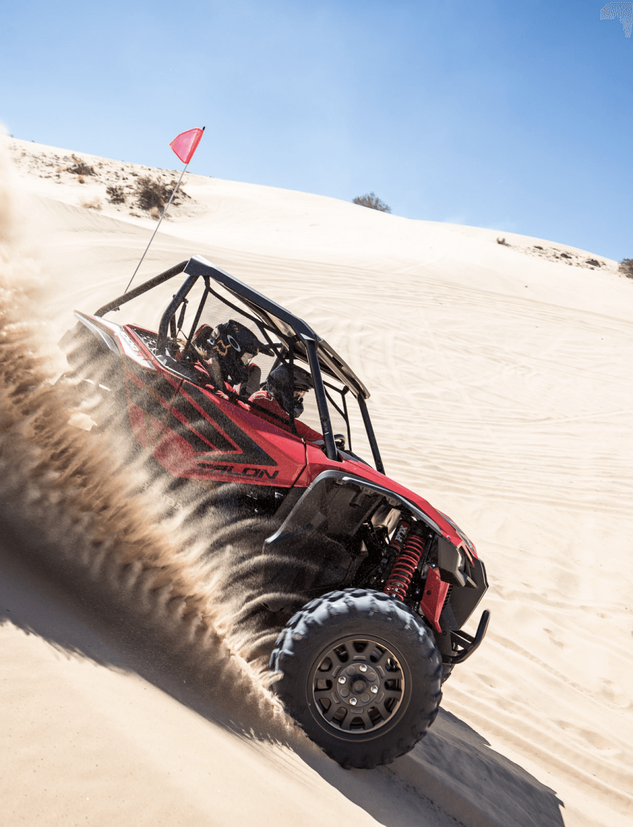
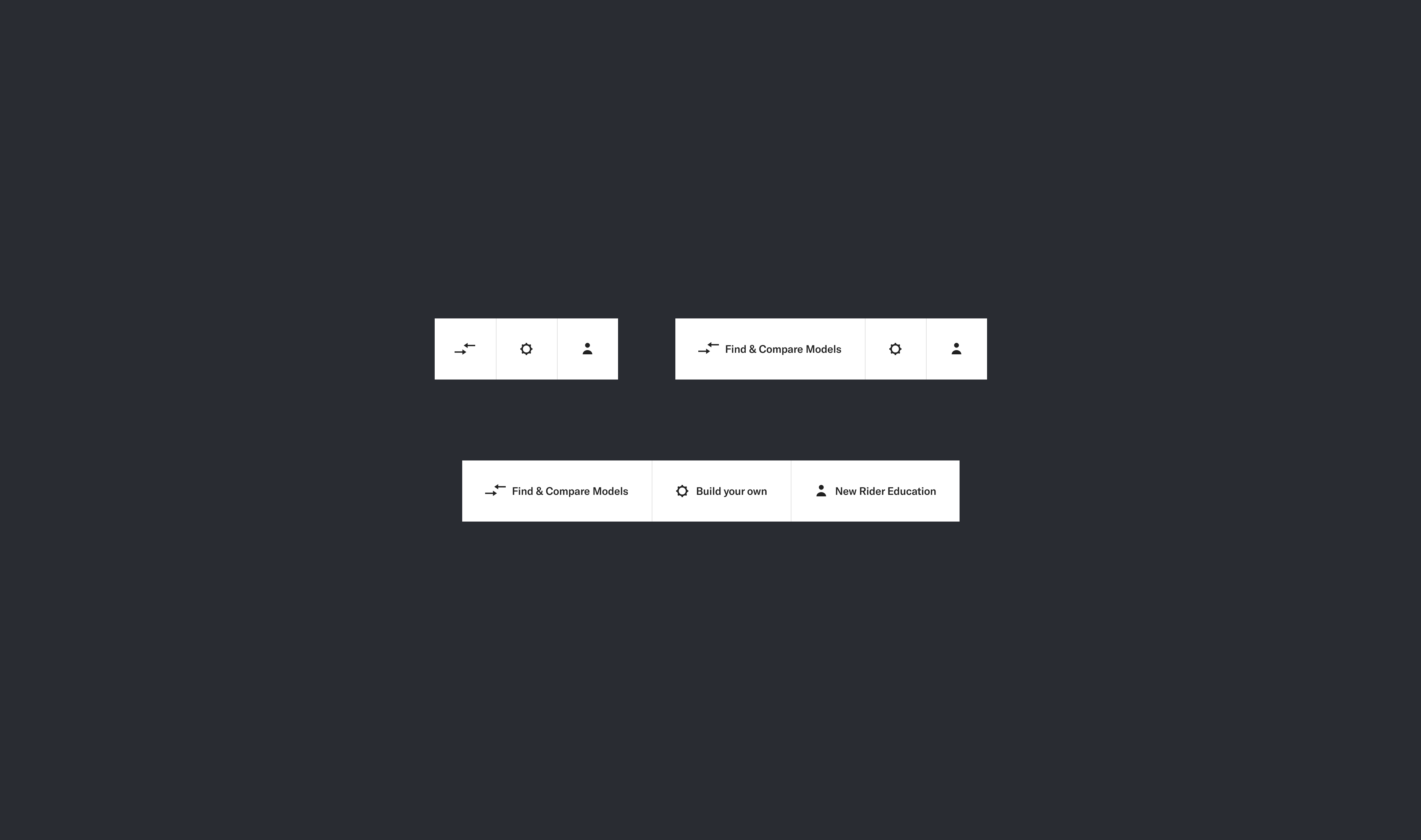
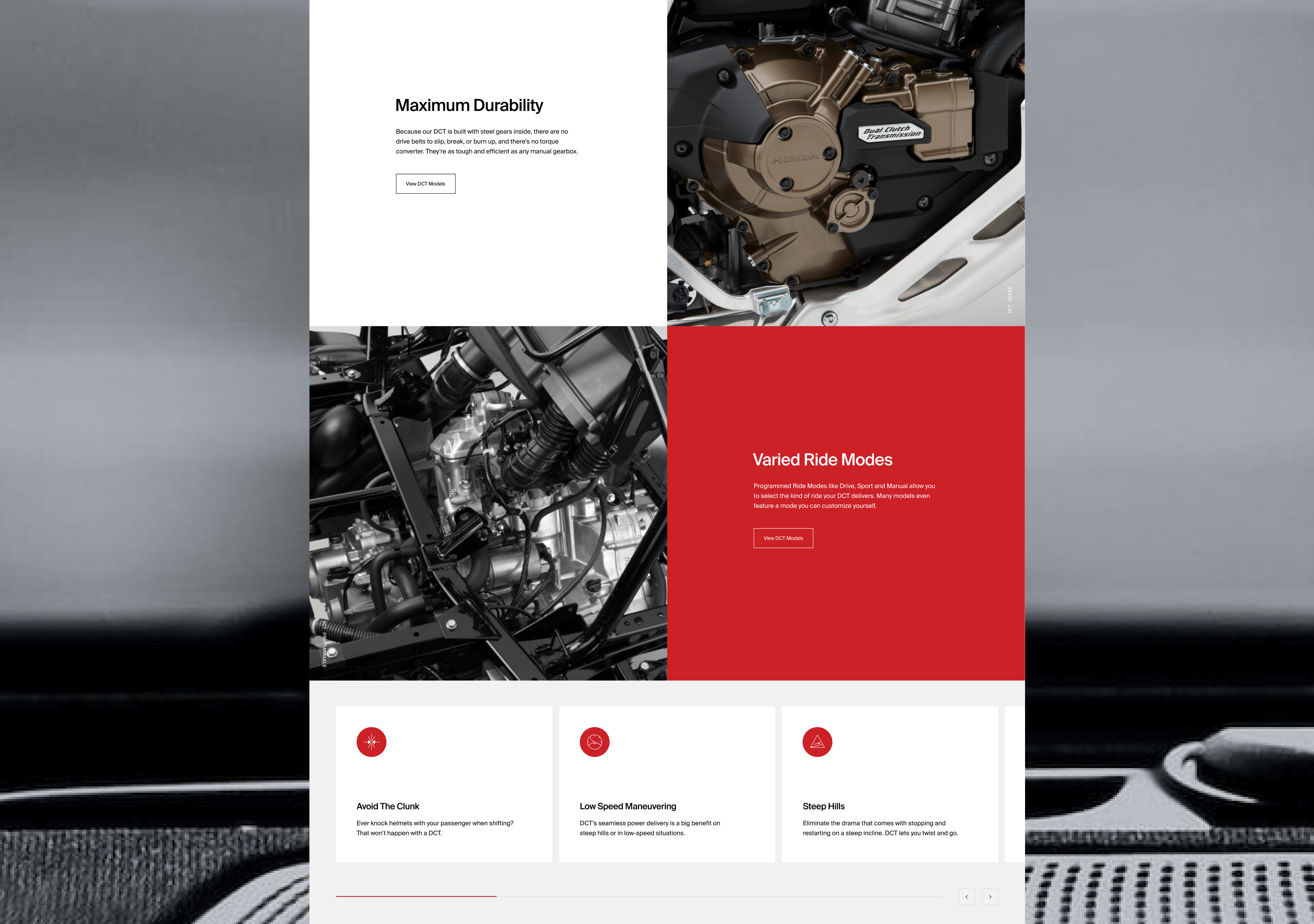
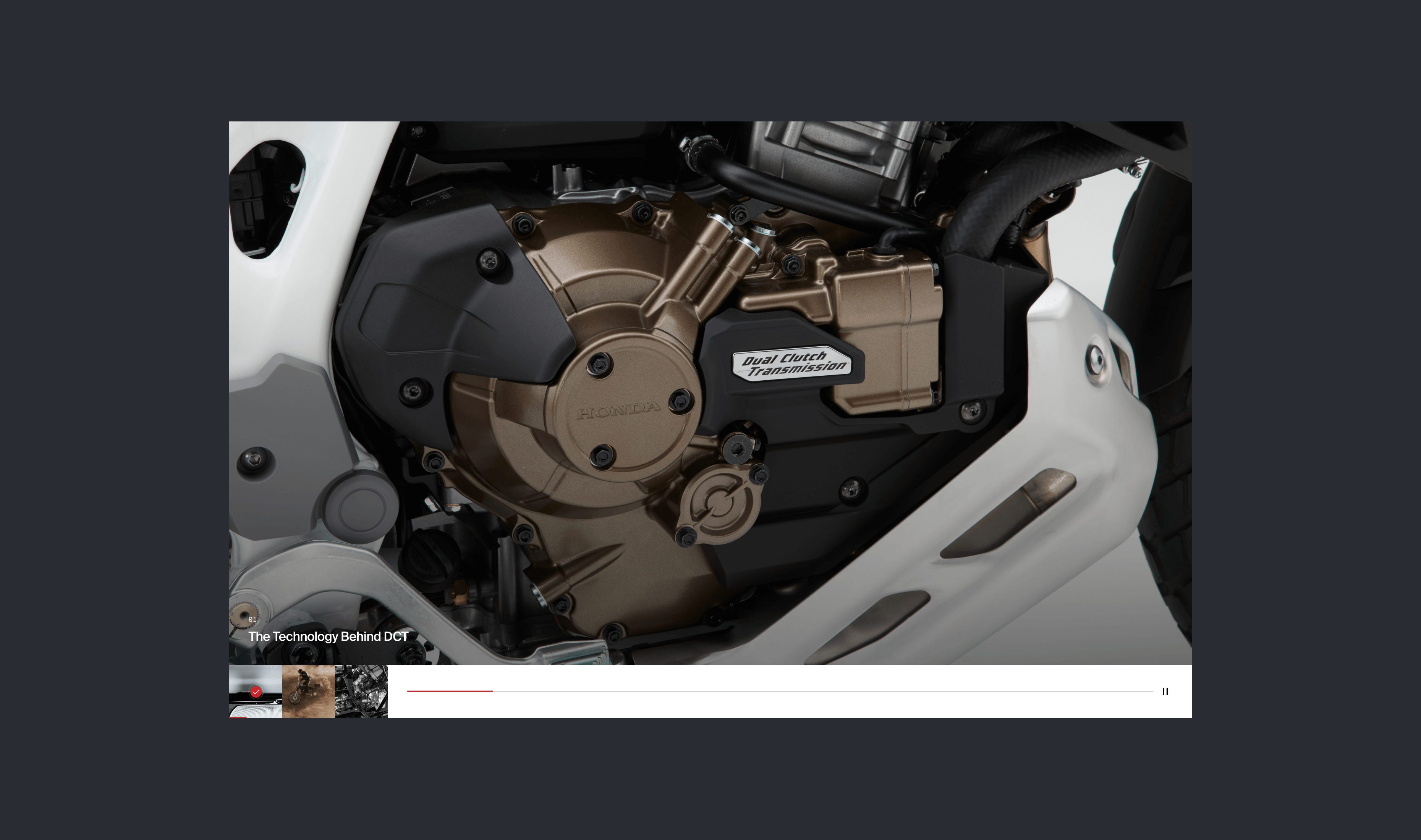
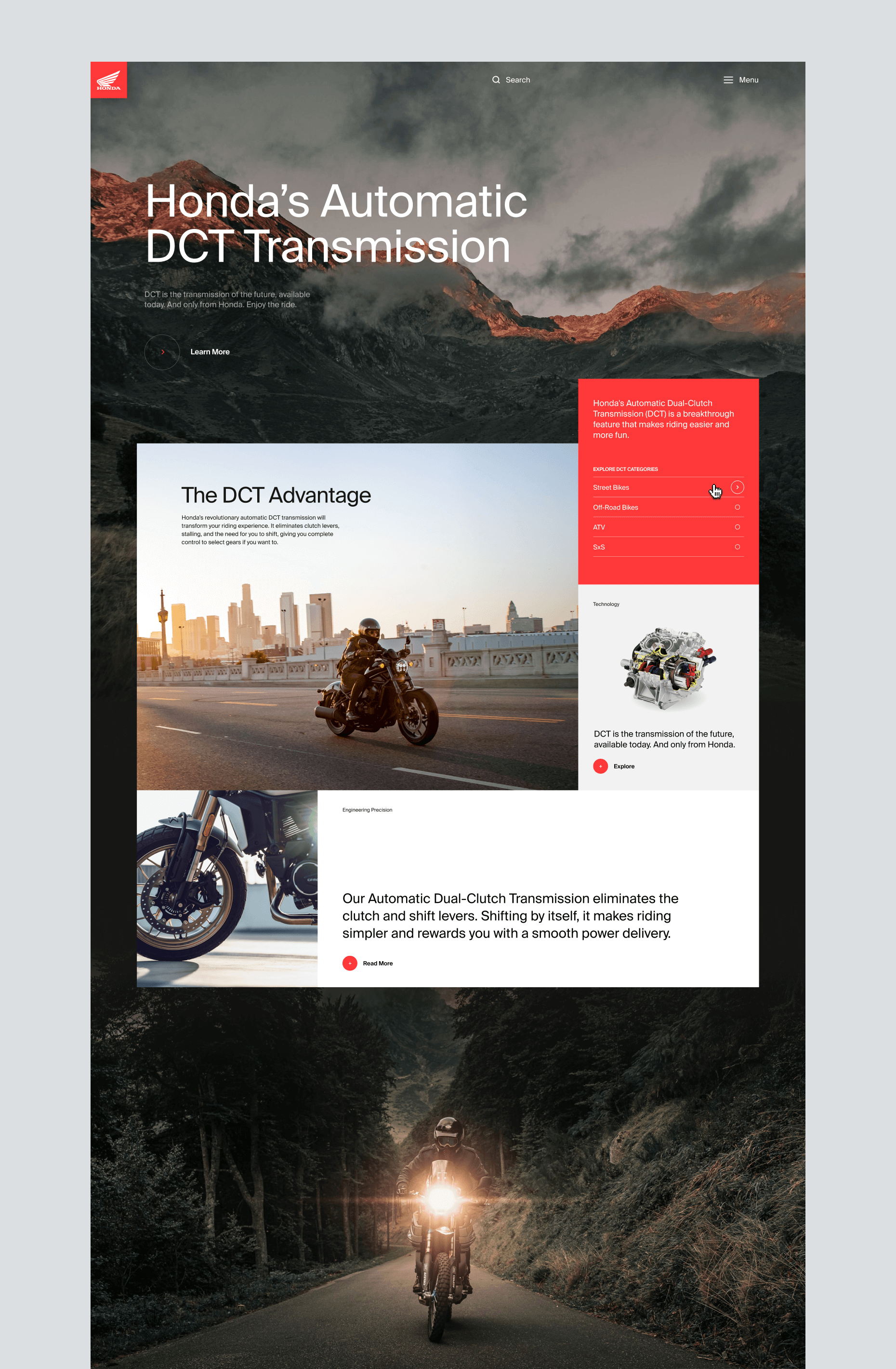
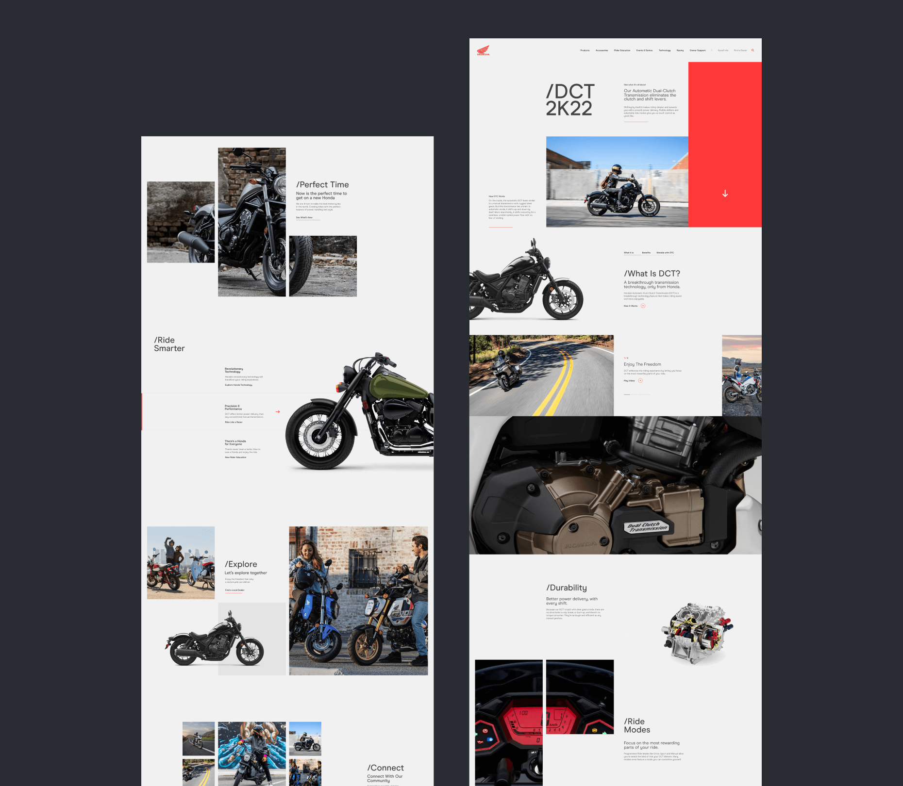
Direction 3
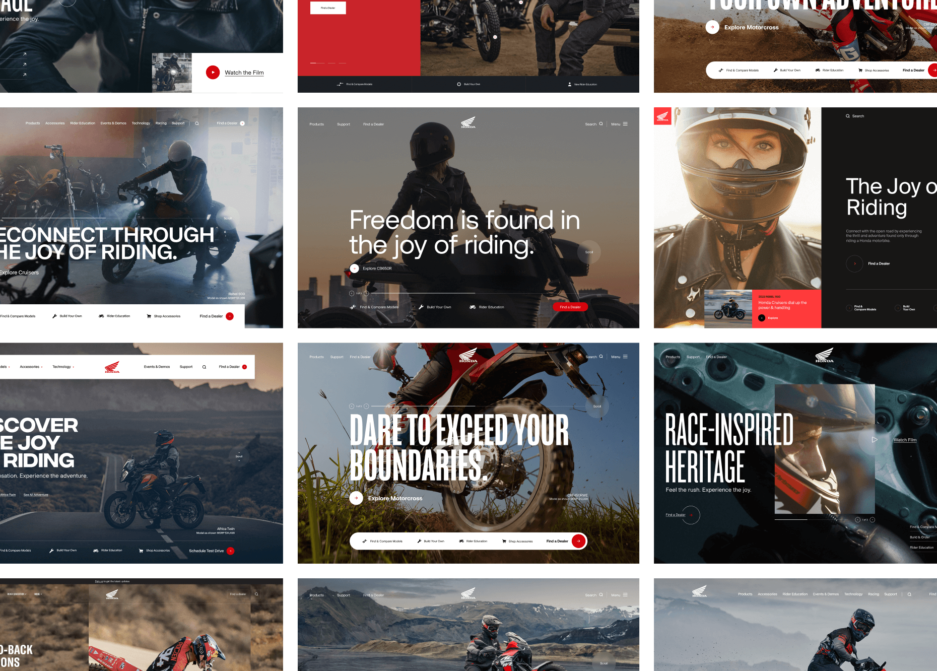
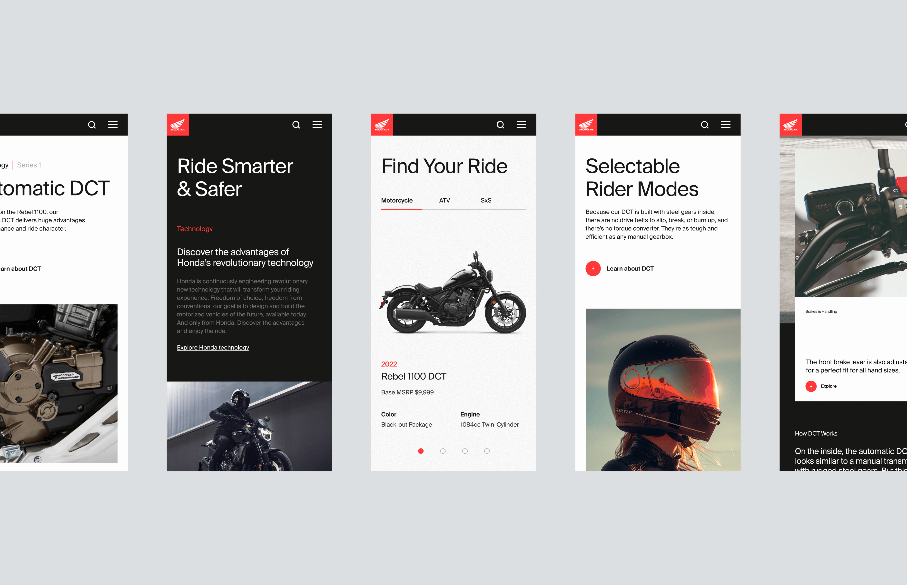
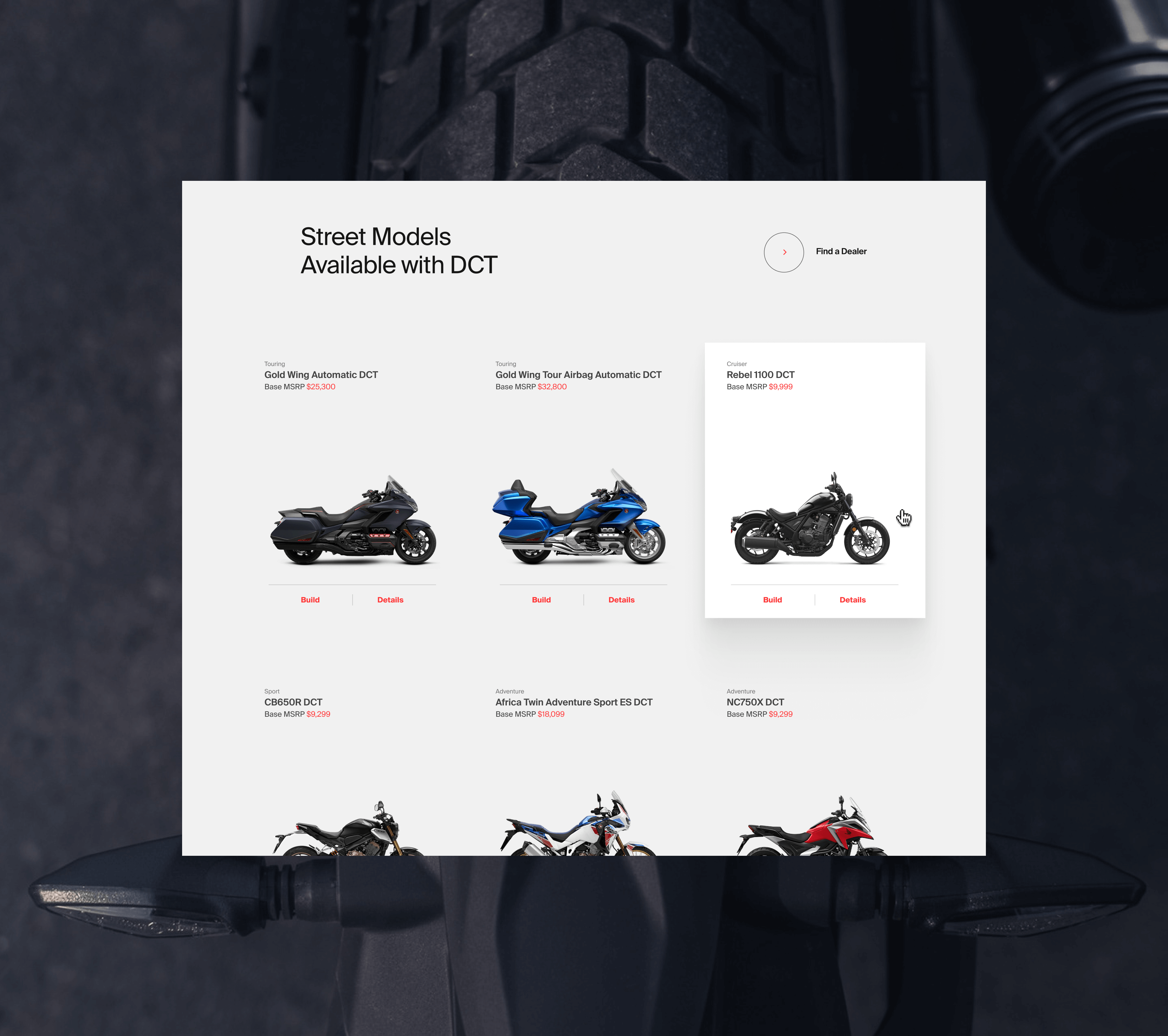
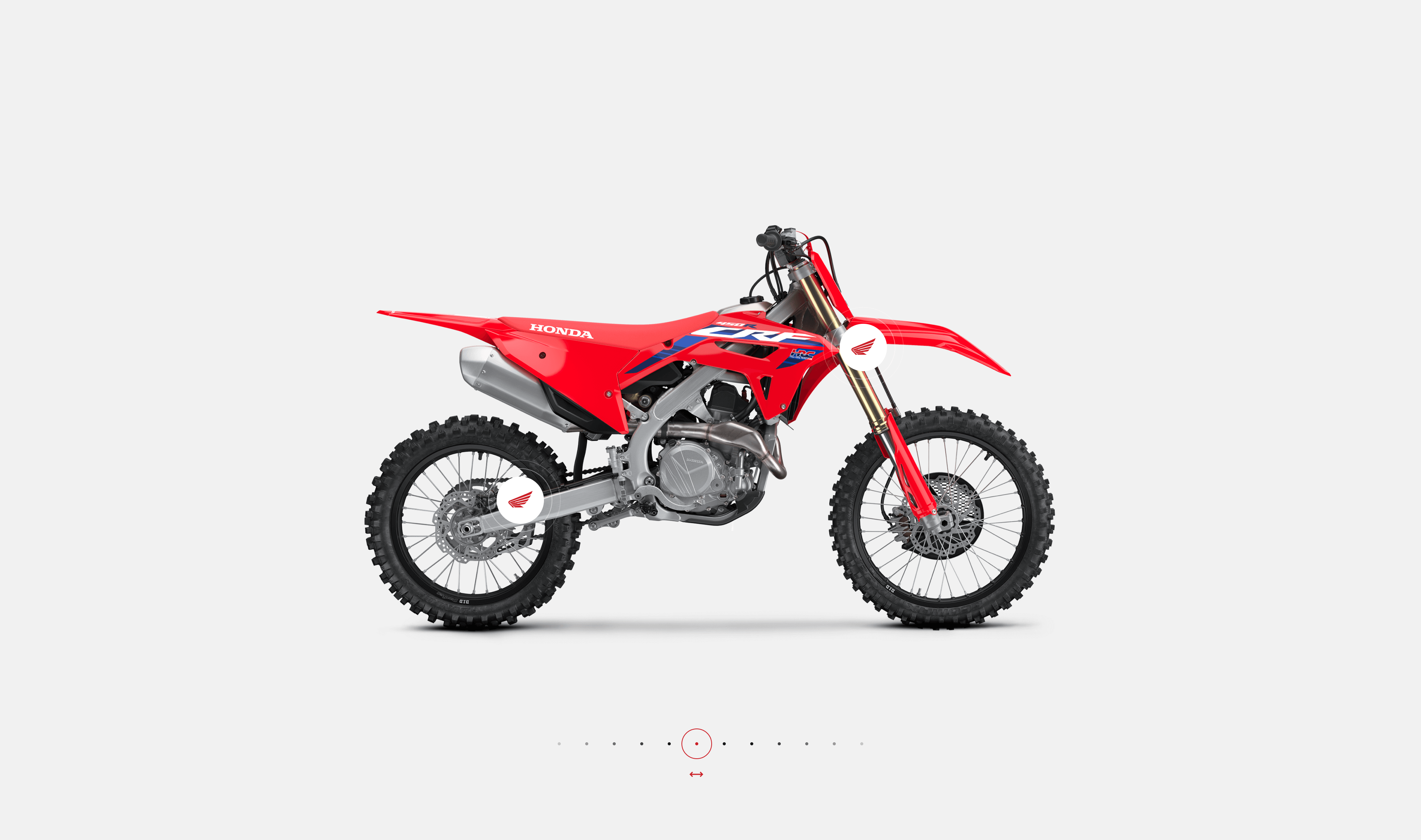
Design direction 3 explores more stylistic nuances created through layouts that are grid-based yet feel organic and unexpected. Image are sometimes broken up into multiple panels or tiles and typographic blocks are trickled throughout the layout to draw the user's eye down the page.
TrueCut Motion
Creative Direction, Visual Identity Design
Honda Powersports
The team at 9th Wonder was in need of additional creative firepower to help imagine a new and improved version of the Honda Powersports website. They hired Idol to bring an outside perspective and provide expertise across UX and UI design.
With our rich history working in automotive, this project was right in our wheelhouse. Across a fast and furious two week design sprint, we developed more than three robust design directions to help steer the legacy brand into the modern age.
Challenge
The internal design team at 9th Wonder was hitting a creative roadblock and needed fresh perspective and outside design thinking.
Approach + Solution
Often times large agencies and other organizations will lean on us to provide our unique perspective and expertise. We can collaborate like an integrated partner or turnkey creative team, thanks to the decades we spent sharpening our skills at large global agencies.
This is especially relevant when it comes to the automotive industry and digital UI design for screens and sites. Over the years we've worked on sites and campaigns for some of the biggest automotive manufacturers, including Toyota, Acura, and Honda. So when 9th Wonder approached us with an opportunity to explore a range of design concepts to help steer and reimagine the dot com experience for Honda Powersports, we couldn't resist.
The engagement was short, with only a two week window to facilitate a series of UX + UI Design sprints, and we were ready to rise to the challenge. Sometimes projects with such tight constraints are the most interesting and effective since there is no time to overthink or noodle an idea too much. It forces you to be comfortable with trusting your gut and making decisions.
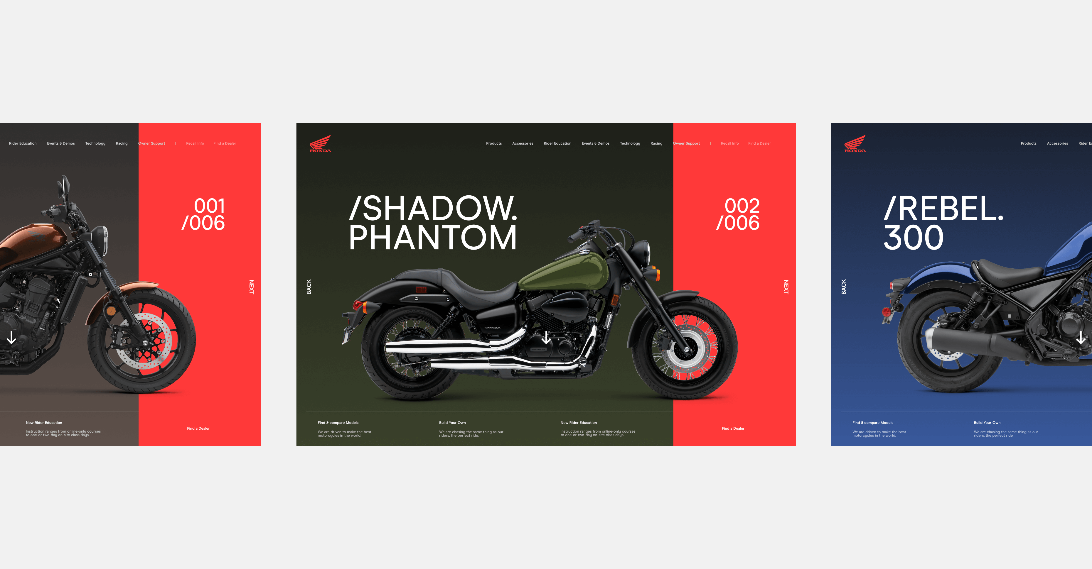
Our team jumped in quickly and worked at an accelerated pace, coming up with four complete design directions and an extra series of alternative hero sections, complete with distinct navigation structures, typographic styles and UI elements. Each of our primary directions provided a unique approach and flavor, brought to life with various differentiations in layout, photography, color, typography and UI components. This diverse collection of design concepts not only facilitated a creative dialogue but also charted a course for Honda's digital future, underscoring our role in shaping their future vision.
Results
The output and effect of our collaborative work is still in progress.
Clients
Marcus Wesson, Dave Bascand